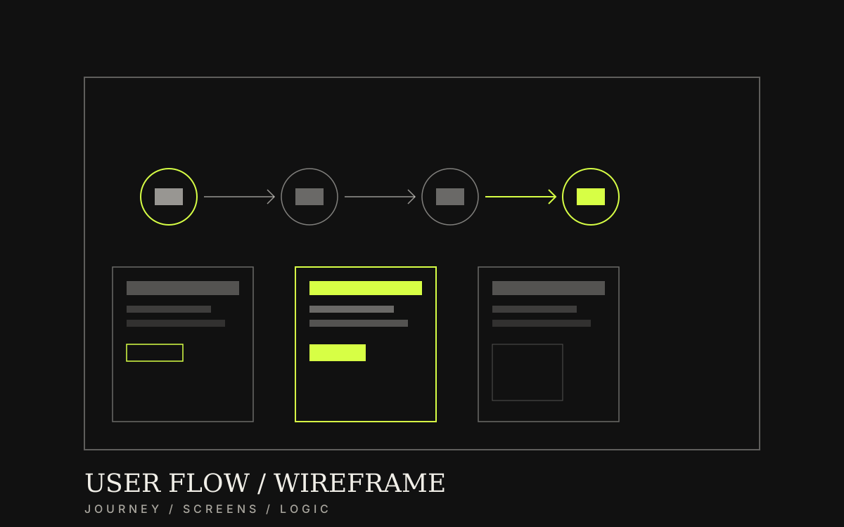
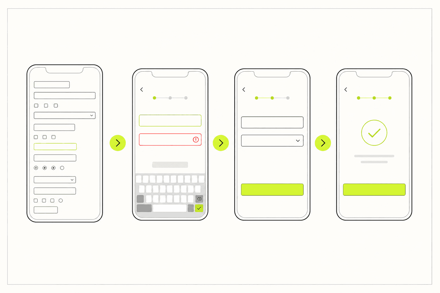
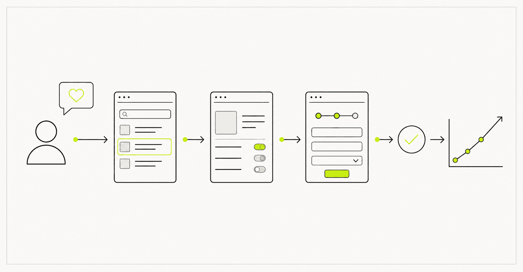
Lock user paths and page structure before visual design—so business and dev teams agree on which buttons matter, which pages are required, and where people tend to abandon.
Category / Web DesignEstimated timeline / 2–4 weeksBudget / Quoted after we review flows and screens
Scroll to continueEN / 2026
Many teams debate colours and fonts when they still do not know how many pages a user must pass before reaching the goal. Flow/Wireframe work locks behaviour before beauty and reduces revision rounds after UI investment.
A strong fit when
This service fits when
Projects with forms, booking, purchase, or signup journeys
Teams that want to test page order before UI
Work with multiple roles or competing actions on a page
Expected outcomes
What the work should make clearer
Business and dev teams agree on the primary path before colour work
Key pages have locked structure with content order and CTAs ready for UI
Drop-off points are identified with handling strategies from the start
Quick summary
What you get when you hire this service
05
01Maps for one to three primary flows
02Wireframes for key screens with content order
03Locked CTA and content hierarchy
04Notes for empty/error states worth covering
05Files ready for UI or development handoff
From clients
What people who worked with us notice
“Before a full flow, the team argued button-by-page. After mapping end-to-end, duplicate steps were obvious—we cut to three pages and drop-off fell in month one.”
“Wireframes were not pretty—but developers could talk from them immediately. Late structural rebuilds dropped.”
Related work
Example work clients can review
Swipe through cases close to your brief. Each one focuses on a measurable outcome—not looks alone.
They pay off when users must complete multi-step actions, or pages are dense with competing CTAs. For a short stable profile page, you may move to UI after IA without a long wireframe cycle.
They pay off when users must complete multi-step actions, or pages are dense with competing CTAs. For a short stable profile page, you may move to UI after IA without a long wireframe cycle.
Sample case: an insurance company (name withheld under NDA) had a four-page claim form with over 40% abandonment at the document-upload step. The product team wanted to reduce steps and reorder blocks but had no overview of which buttons overlapped.
After mapping the full flow and wireframing key pages, the team found the confirmation step duplicated the previous page. They consolidated to three pages and moved the upload button earlier—before the long data entry. Drop-off fell about 18% in the first month after the change.
Before: 4 pages, 40%+ drop-off at upload
After: consolidated to 3 pages, upload visible earlier, drop-off down ~18%
Lesson: lock flow and block order before colour—fewer button moves after UI ships
02
What to clear before framing screens
Before wireframes, know each page’s goal and what counts as success.
Drawing every screen in high detail too early slows work before the primary flow is locked.
01
What to lock before drawing frames
Focus on journeys the business actually cares about.
Primary conversion or action
Common entry points (ads / menu / search)
Required pages in that path
Important exceptions (login, stock, empty states)
Primary devices users use
Locking the primary flow before page detail reduces UI reshuffling later.
03
What we actually deliver
Useful flows and wireframes let business and engineering agree on page order and primary actions before colour work starts.
We map one to three primary flows, wireframe the key screens on those paths, and note CTAs plus empty/error states for UI handoff.
Example: an 11-field booking form became two steps after the wireframe showed drop-off at the address block.
Define and draw primary flows
Wireframe key pages in the path
Mark CTAs and content order
Review with stakeholders, then hand off to UI
Wireframes should clarify order and priority—not brand colour.04
Work order—and what breaks when wireframes are skipped
A useful order is goals → flows → wireframes → review → lock → UI.
Jumping to UI first often moves buttons and forms repeatedly after stakeholder feedback.