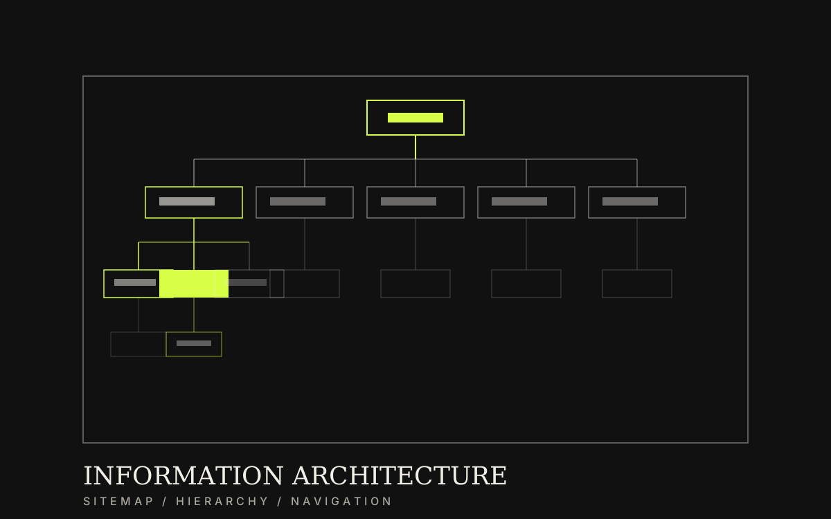
Structure menus and pages so people can find things
Analyse tasks customers come to do, group menus and pages so services are found in a few clicks, and show the team where new content belongs.
Category / Web DesignEstimated timeline / 1–3 weeksBudget / Quoted after we review the page inventory
Scroll to continueEN / 2026
Many sites have enough content but users cannot find it, because menus mirror internal departments instead of user tasks. Cases from an insurer and a public-service portal show that clearer menu structure reduces repeat questions and lifts mobile completion.
A strong fit when
This service fits when
Sites with many services or growing content and confusing menus
Teams merging or cutting pages before a redesign
Projects that need a clear sitemap before UI
Expected outcomes
What the work should make clearer
Customers find core services faster—repeat chat questions drop
The team knows where new pages and content go without guessing
Menu structure is ready for flows and UI without late reshuffles
Quick summary
What you get when you hire this service
05
01Page inventory with each page’s job
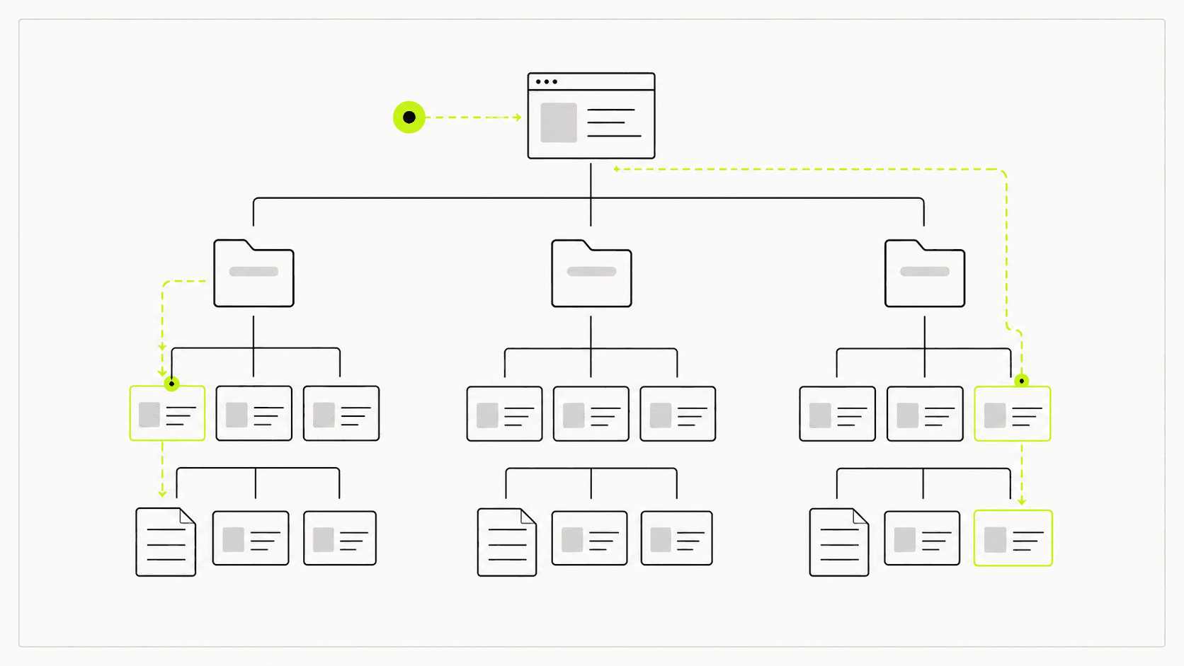
02Primary menu and navigation structure
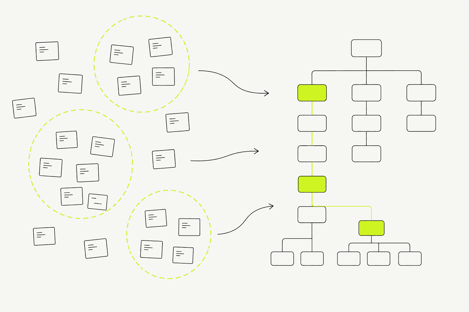
03Content/service groupings in customer language
04Recommendations to cut, merge, or create pages
05A sitemap document the team can keep using
From clients
What people who worked with us notice
“After menus followed user jobs, people found packages faster and basic-info calls dropped—without a rebrand.”
“Grouping services by life events instead of org charts made mobile form completion jump in the pilot.”
Related work
Example work clients can review
Swipe through cases close to your brief. Each one focuses on a measurable outcome—not looks alone.
It pays off when you have many pages, many services, or ongoing content growth without rules.
For a single landing page, full IA is often more than you need.
Fictional insurance scenario: the site has multiple packages, but the menu buries them. The IA direction surfaces key services in the top navigation and groups them by coverage so customers and sales can reference the same pages.
Another case from Civic Desk (public-service portal): residents could not find steps or documents because menus followed the agency chart. After grouping services by life events (registration, housing, taxes) and redesigning mobile forms, mobile form-completion rate rose 44%.
Before: menus followed org chart, customers could not find services, repeated questions
After: menus follow user tasks, services found in a few clicks
Lesson: label menus with words customers search—not internal department names
02
What to clear before shaping the menu
Before a sitemap, list real services/content and primary user groups.
Menus shaped like org charts usually lose customers.
01
What to gather before structure work
These keep the sitemap from changing every week.
Real services or content categories
Jobs users come to the site to do most often
Required business or legal pages (if any)
Content to cut, merge, or move
Who approves labels and structure
Menus shaped around user tasks make services findable before UI polish.
03
What we actually deliver
Strong IA leaves a sitemap and navigation rules the team can maintain—not a one-off pretty diagram.
We review real content and services, group labels in customer language, run a light understanding check, and hand over structure docs with merge/cut recommendations.
Example: a services site collapsed twelve menu items into five task-based groups, and “where is that page?” Line questions dropped after the new structure went live.
Review existing and needed pages
Group and label navigation
Draft sitemap and primary paths
Quick understanding checks, then lock for handoff
Good IA moves people from a question to an answer page without redundant menus.04
Work order—and what breaks when IA is skipped
A useful order is inventory → grouping → menu draft → short test → lock sitemap → flows/UI.
Jumping to visuals first often forces a full menu reshuffle near development.
01
How we work
Short cycles with content owners.
Collect real pages and services
Group in user language
Draft and lightly test menus
Lock the sitemap for the next design stage
02
Checks before UI
Prevents coming back to rewrite navigation during UI.