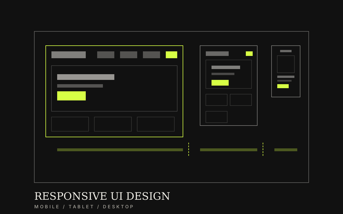
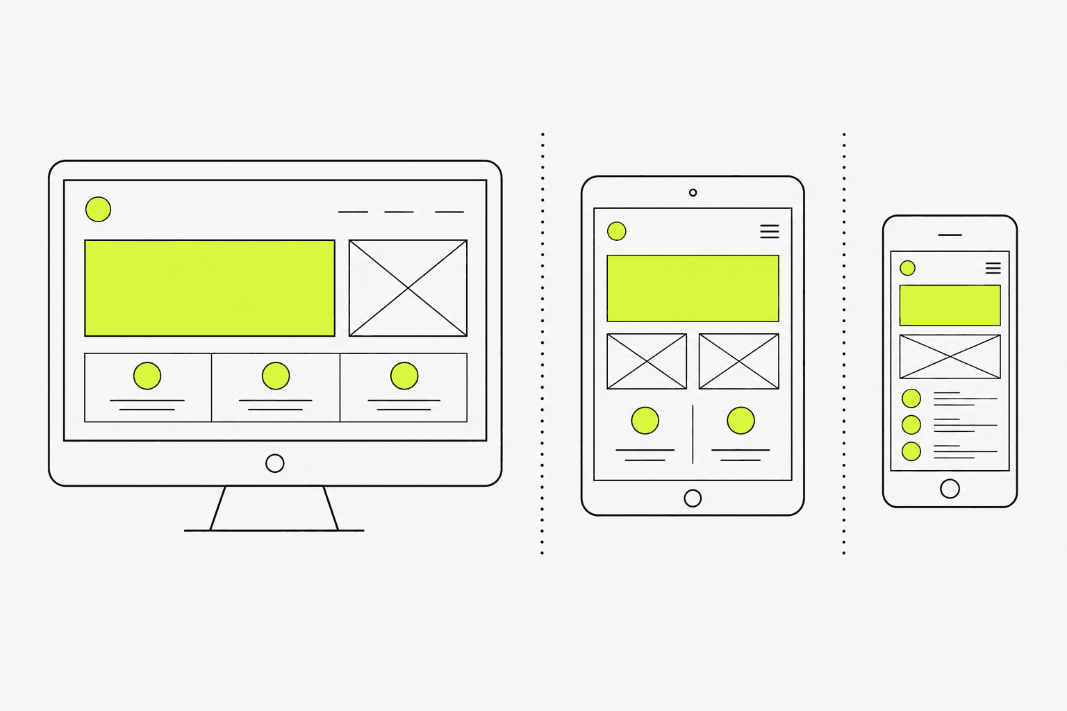
Transform locked structure into real screens that work on mobile and desktop—with components, states, and specs developers can build from without backtracking.
Category / Web DesignEstimated timeline / 3–6 weeksBudget / Quoted after we review screens and components
Scroll to continueEN / 2026
UI that looks fine on desktop but breaks on mobile usually comes from colouring before structure is locked. Strong responsive UI starts from key pages and real behaviour, then grows into a repeatable component system.
A strong fit when
This service fits when
Projects with structure or wireframes already locked
Teams that need UI files for web development
Brands that want consistent screens across devices
Expected outcomes
What the work should make clearer
Key pages designed for mobile and desktop together—no late shrink-pass breakage
Reusable core components and common states systemised
Files and specs ready for development without back-and-forth questions
Quick summary
What you get when you hire this service
05
01A visual direction aligned to the brand
02Responsive designs for key pages (mobile + desktop)
03Core components and basic states that scale
04Spacing, type, and colour specs for build
05Handoff files for the development team
From clients
What people who worked with us notice
“The old site broke on mobile while over half of traffic was mobile. After mobile-first design alongside desktop, bookings rose without more ad spend.”
“Reusable components kept new pages consistent—and developers stopped guessing button sizes on every screen.”
Related work
Example work clients can review
Swipe through cases close to your brief. Each one focuses on a measurable outcome—not looks alone.
When to move into UI—and why mobile-first saves rework
It pays off when IA or wireframes are clear and you are ready to invest in visuals developers will actually build. If menus or forms still move weekly, full UI sets get expensive through rework.
When to move into UI—and why mobile-first saves rework
It pays off when IA or wireframes are clear and you are ready to invest in visuals developers will actually build. If menus or forms still move weekly, full UI sets get expensive through rework.
Sample case: an interior-design studio (name withheld under NDA) had a desktop-only site. Service pages used large images and long copy—on mobile, the showroom-booking button was hidden and hard to tap. Over 60% of traffic came from mobile, but bookings lagged far behind desktop.
After redesigning mobile-first alongside desktop, mobile sessions rose 41% and showroom bookings increased 2.1× in the first quarter—without increasing ad spend.
Before: desktop-only UI, booking button hidden on mobile, low conversions
After: mobile-first alongside desktop, mobile sessions +41%, bookings 2.1×
Lesson: design mobile and desktop together from the start—fewer broken shrink passes later
02
What to clear before visual design
Before UI files, lock page list, content order, and a minimum brand direction.
Decorating pages without component rules usually creates inconsistency across the site.
01
What to lock before colour work
Reduces late rework near handoff.
Key pages in this design round
Logo, colours, and usable fonts
Development or platform constraints
Primary devices to support
Approvers and who receives build files
Designing mobile and desktop together prevents key pages from breaking when the viewport shrinks.
03
What we actually deliver
UI worth building ships as screens that work on mobile and that engineering can implement—not desktop-only mockups.
We set visual direction, design key pages responsively, define reusable components and common states, then hand off files with specs.
Example: a contact button that used to be tiny and covered on phones was designed for mobile and desktop together, so it never needed a broken shrink-pass later.
Define visual direction
Design key pages responsively
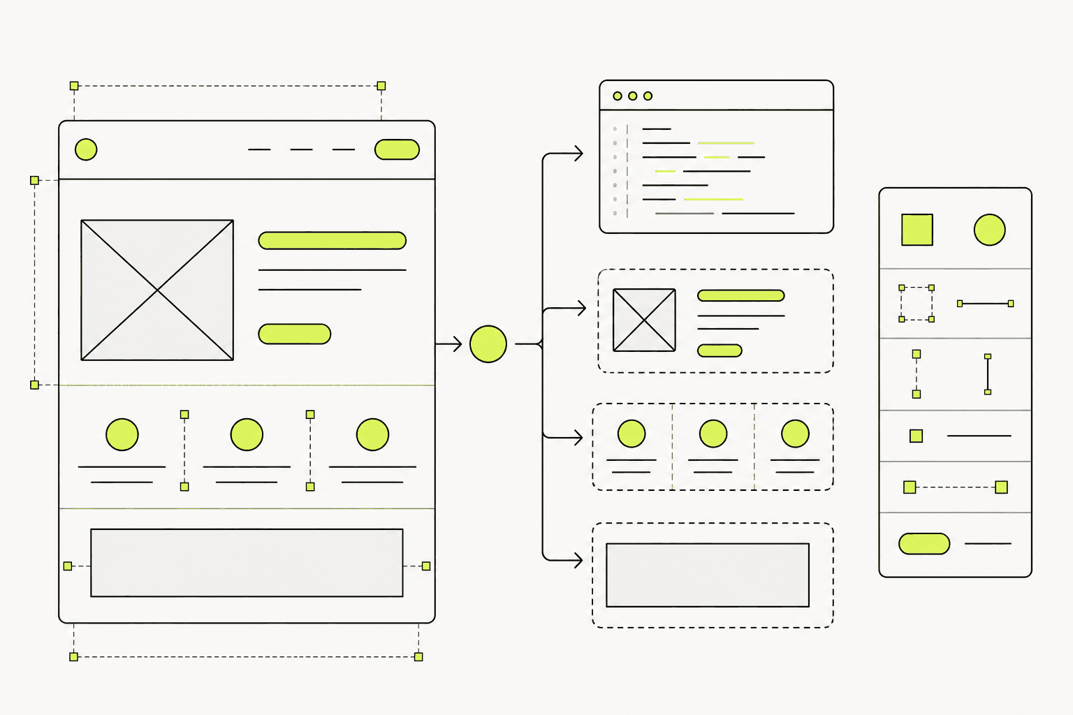
Systemise frequently used components and states
Hand off files and specs to development
Reusable components keep new pages consistent and faster to build.04
Work order—and what breaks at development handoff
A useful order is visual direction → key mobile/desktop pages → components → review → handoff.
At handoff, common gaps are missing spacing specs, incomplete form states, and mobile treated as a late shrink.
01
How we work
Short review cycles with brand and engineering owners.
Lock visual direction and page list
Design key pages across agreed breakpoints
Organise components and states
Hand off files with a short walkthrough
02
Checks before development
Fewer questions during coding.
Key pages cover mobile and desktop
Colour, type, and spacing are readable from files
Button/form states have examples
Developers know the latest file source and version