Strong information architecture helps people find what they need without understanding the company's internal departments. It starts with customer language, the tasks they are trying to complete, and the shortest clear route to useful content.
Quick summary
What you get from this article
- Group content by the jobs customers come to do, not by your org chart.
- Name navigation with the words customers use when searching.
- Keep any page within three clicks of the homepage.
- Give each topic one page that owns it.
- Test the structure with real people before designing screens.
What information architecture is and why it matters
Information architecture is the decision about which pages exist, which pages sit under others, and what each page is called. It is invisible in the design file, but it decides whether customers can find what they need.
When structure is wrong, design cannot fix it. However polished the layout looks, content placed where customers do not expect it stays hard to find.
Example case (name withheld): a web agency grouped its menu by internal departments. After regrouping by customer tasks — see services, compare pricing, view work — the rate of visitors reaching contact from a service page rose roughly 35% in four weeks.
Image slot prepared — artwork to follow
Image slot — org-chart menu vs task-based menu comparison
Group by customer tasks, not org charts
The most common mistake is organising the menu by internal departments or team names, which customers neither know nor care about.
Start from the jobs customers come to do: see what you offer, compare pricing, view similar work, or request a quote. Then group content to support those jobs.
Label with customer language
A good menu label tells visitors immediately what is inside. A quick test is whether people actually search for that phrase and whether customers use it in chat or on calls.
- Use plain familiar words, such as website design, instead of digital solutions
- Avoid internal jargon and branded service names in the primary menu
- The same label must mean the same thing everywhere on the site
- If a label needs a subtitle to explain it, the label is not clear enough
Image slot prepared — artwork to follow
Image slot — menu labels customers understand vs internal terms
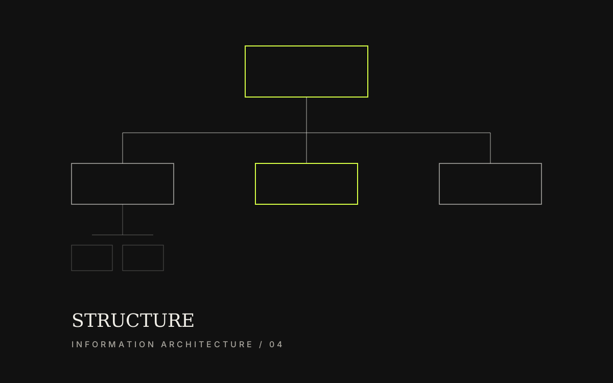
Keep hierarchy no deeper than three levels
From the homepage to the page a customer needs, three clicks is a practical limit. Deeper pages are harder for people and search systems to reach and are often forgotten together.
URLs should mirror the same hierarchy as the menu so the address itself hints at where someone is on the site.
Breadcrumbs that reflect the hierarchy help search visitors understand where they are and move back easily.
- Home → main category → target page, no deeper than three levels
- URLs stay short, readable, and stable unless change is necessary
- Deep pages link back to the main category clearly
Image slot prepared — artwork to follow
Image slot — URL hierarchy and breadcrumbs within three levels
One topic, one responsible page
When several pages say the same thing with no distinct role, customers wonder which one to read and search systems struggle to choose a primary page to rank.
Give each topic one main page that answers it fully. Supporting pages should add detail and link back to that main page.
When articles and service pages overlap, decide which page serves hiring intent and which serves research intent.
- One primary URL per main topic
- Supporting pages link back with descriptive anchor text
- Do not create a new page for a slightly different label only
Test structure before screen design
Structure can be tested without visuals. Write every page name on paper or in a file and ask five people who did not build the site where they would click to complete a task.
Five participants is often enough to reveal misleading labels and missing categories. Fixing now costs almost nothing compared with fixing after development.
Image slot prepared — artwork to follow
Image slot — card sort or tree test for website structure
Preparation
Information to prepare before you start
- The list of jobs customers come to the site to do
- The words customers use for your services
- A full page map no deeper than three levels
- The page that owns each topic
- Structure test results from at least five real people
Related services