A corporate site customers can understand on their own
Start with page structure and the questions customers ask most—then design, build, and hand over a content system so the site supports sales, not just display.
Category / Web DevelopmentEstimated timeline / 4–8 weeksBudget / Quoted after we review pages and content
Scroll to continueEN / 2026
Many businesses already have a site, yet customers still call about pricing, services, and address—details already on the pages. The usual cause is not an old colour palette. It is a menu people cannot navigate, forms that are too long, and a team that cannot edit without a developer.
A strong fit when
This service fits when
SMEs and mid-size companies that need customers to understand services before a call
Businesses with an old site that is hard to navigate, or content the team cannot edit
Organizations that need clear service pages plus forms and contact details that actually work
Expected outcomes
What the work should make clearer
Fewer basic inbound questions—customers find services and contact paths themselves
The team updates pricing, offers, or service pages within a day without waiting on a developer
Forms and contact buttons work on real phones, not only on desktop screenshots
Quick summary
What you get when you hire this service
05
01A page list and menu matched to real services, with a clear job for each page
02Design and development of key pages that work on mobile
03A CMS for pages that change often, plus a short handover guide
04Form, notification, and basic measurement checks at launch
05A redirect table if URLs move, plus a pre-launch verification pass
From clients
What people who worked with us notice
“After primary services moved into the top menu, calls asking for address and service lists dropped. Sales got leads with context—not just a phone number.”
“Updating pricing or offers used to wait a week on a developer. Now the team edits the same day—and we knew the page scope from the first conversation.”
Related work
Example work clients can review
Swipe through cases close to your brief. Each one focuses on a measurable outcome—not looks alone.
Why build a corporate site—before talking about looks
Ask these before picking colours: can customers find service pages without messaging chat, can the team update pricing or offers within a day, and do form leads arrive with enough detail for sales to continue the conversation?
Why build a corporate site—before talking about looks
Ask these before picking colours: can customers find service pages without messaging chat, can the team update pricing or offers within a day, and do form leads arrive with enough detail for sales to continue the conversation?
If the brief is only “the site looks outdated,” the project drifts into colour and font changes while the structure that makes people miss the offer stays intact.
A sample case from a B2B consulting firm (name withheld under NDA): daily traffic, but only 4–6 form leads a month—mostly phone numbers. Sales had to call back just to learn which service the visitor cared about.
One pass of changes: primary services moved to the top-level menu, the form cut from 11 fields to 5, and work samples placed on service pages. Within eight weeks, sales-ready leads roughly doubled—without changing the logo or colour system.
Before: traffic existed, but leads were thin and basic inbound questions stayed high
After: services sat in the top menu, the form was shorter, and leads had enough context to continue
Lesson: judge success by usable behaviour—not by whether it “looks newer”
02
Page structure to settle before design
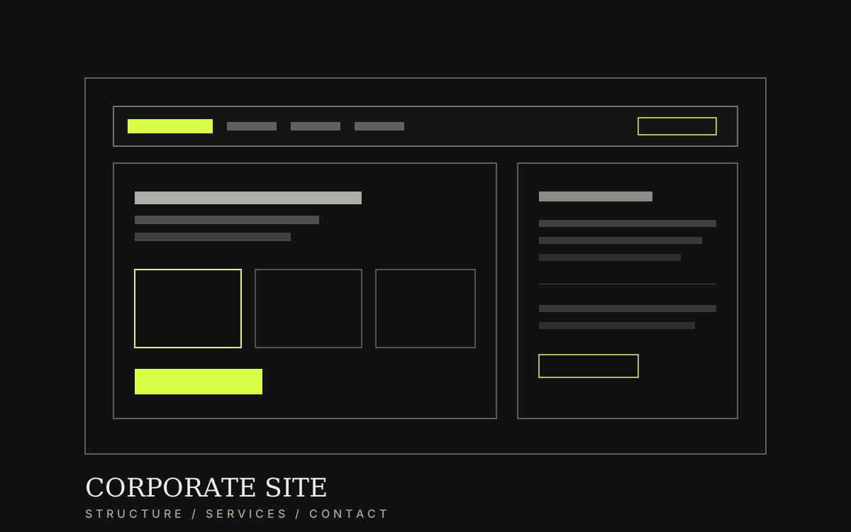
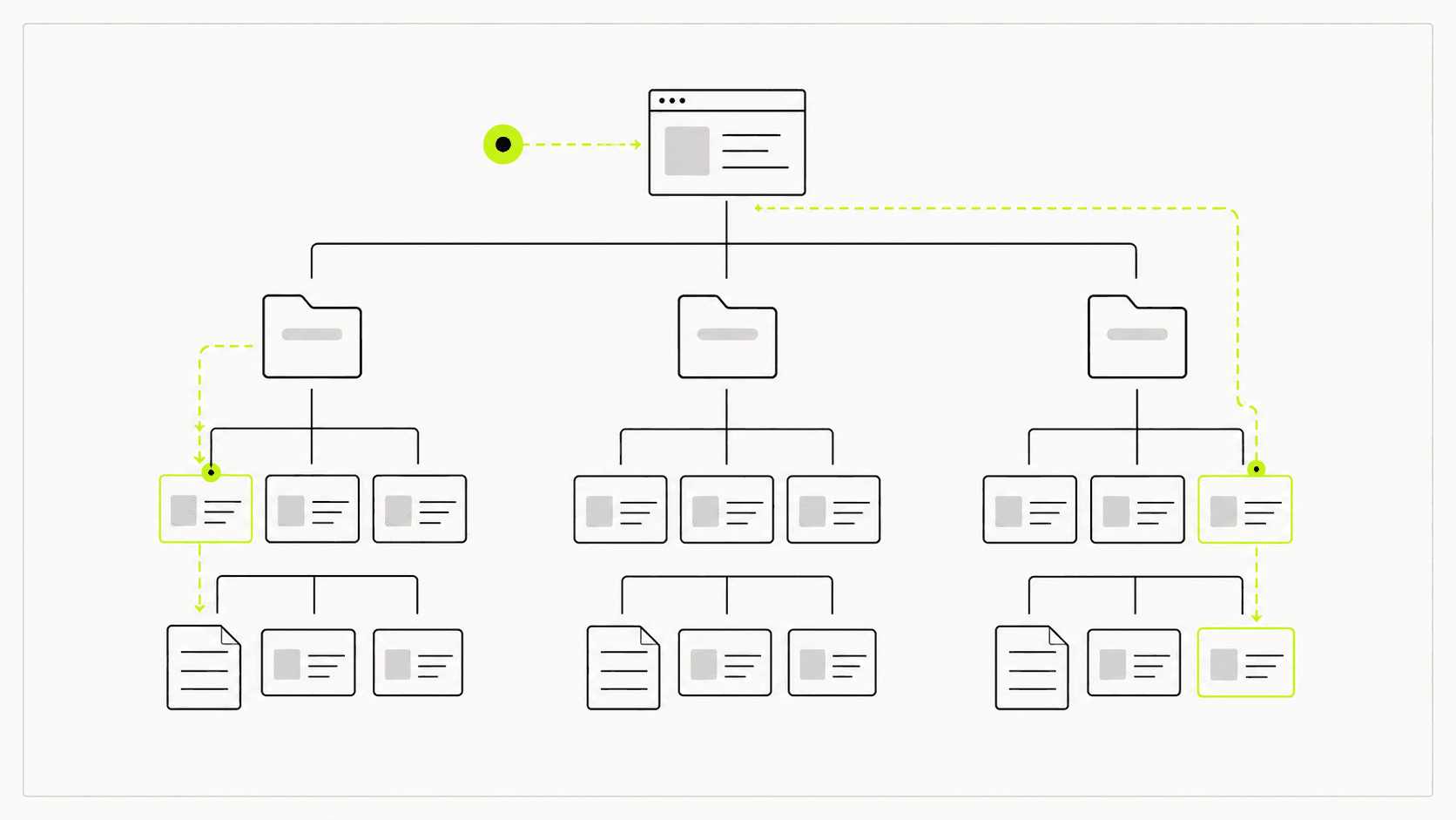
Before opening a design file, the page list and job of each page should be clear. Home summarises and routes forward; service pages answer buying questions; about builds context; work proves delivery; contact closes the conversation.
If the service list is still fluid, visual design gets reworked every time a menu label changes—more expensive and slower than settling structure on paper or in a spreadsheet first.
01
Pages a corporate site usually needs
You do not need every page on day one, but must-have pages should have enough content for a visitor to decide without guessing.
Home: business summary, audience, and paths to services/contact
Services: split by real offers—not one endless catch-all page
About: experience, stance, and reasons to trust the team
Work or cases: examples aligned with the services you sell
Contact: address, phone, map, form, and a reply time you can keep
Clear page structure before design keeps content scope and menus from being reworked at the end.
03
What delivery actually includes
What you should keep after handover is practical: a structure the team understands, key pages that pass mobile use, and content edits that do not need a developer ticket every time.
Typical scope covers structure planning, design of key pages, development, CMS setup, short training, then checking forms and measurement before launch.
Information structure and page list matched to real services
UX/UI for key pages that stay consistent across the site
Development and mobile testing, including forms and alerts
CMS handover, a short guide, and basic measurement points
Home-page order should move from the business summary → primary services → a contact path, without losing people mid-scroll.04
Work sequence—and what usually breaks at launch
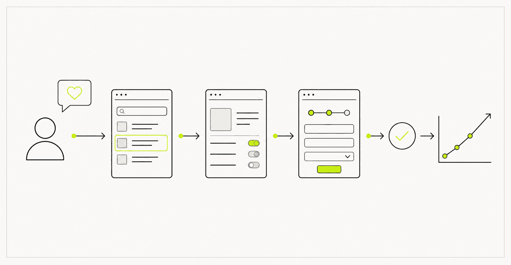
The sequence that protects budget is brief and page structure → wireframes → design → build → test → launch. Reworking the menu after design is finished is where cost spikes fastest.
At launch, failures rarely sit in colour or type. They sit in forms that never arrive, notification email in spam, mobile buttons that cannot be tapped, and URL moves without redirects that drop existing traffic.
01
How the work moves
Each stage has a client checkpoint so large changes do not pile up at the end.
Analyse the business, services, and questions customers ask often
Lock page structure and menu order before visual design
Design and build against the locked scope
Test forms, mobile, and speed—then launch with measurement
02
Checks before going live
One pass with real data before announcing launch costs less than fixing issues after people are already using the site.
Forms and notification email with real data at least once
Key menus and buttons tapable on mobile—not covered by other UI
If URLs change, a page-by-page 301 redirect table
Preparation
Information to prepare before you start
05
01Primary and secondary services that must appear on the site
02Audiences who should understand the business from the home page
03Questions customers ask often by phone or chat
04Logo, work photos, and about copy that can actually be used
05Who will edit content after launch, and how much control they need