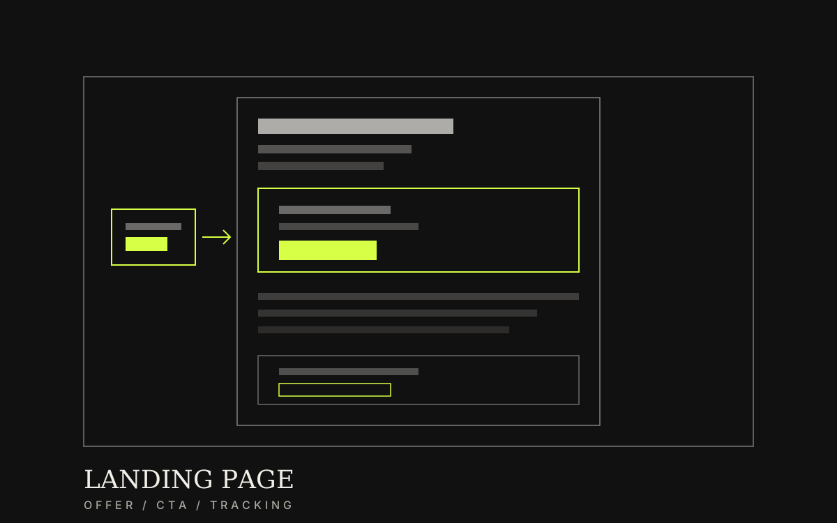
Start from one offer and one measurable action, then design the page—so ad traffic can submit or buy without getting lost in menus.
Category / Web DevelopmentEstimated timeline / 1–3 weeksBudget / Quoted after we review the campaign brief
Scroll to continueEN / 2026
Many campaigns waste spend because the destination is slow, the copy does not match the ad, or the contact button fails on mobile. The usual gap is not “the visuals are weak”—it is a page without one goal, and no way to know who actually converted.
A strong fit when
This service fits when
Ad campaigns that need a clear destination page
Product or promo launches that must capture leads quickly
Teams that need real conversion measurement from ads
Expected outcomes
What the work should make clearer
Ad visitors see one offer and know the next step—without getting lost in menus
The form or convert action works on mobile, and leads reach the team
CPL / conversion is visible from day one—spend is not a guess
Quick summary
What you get when you hire this service
05
01Page structure and copy focused on one offer
02A clear CTA tested on mobile
03A short form or convert point that reaches your team
04Basic campaign tracking connected
05A page fast enough for paid traffic
From clients
What people who worked with us notice
“Sending ads to the homepage meant high CPL and thin follow-up leads. After a single-offer landing page, we finally knew which creatives paid off.”
“The shorter form, sales alerts within a minute, and thank-you conversion counting were ready on launch day—not patched after spend started.”
Related work
Example work clients can review
Swipe through cases close to your brief. Each one focuses on a measurable outcome—not looks alone.
When to use a landing page instead of the homepage
You can send ads to the homepage anytime—but if the goal is one immediate action, full navigation often pulls people away before they convert. A landing page fits when the offer is clear: form, booking, or promo purchase.
When to use a landing page instead of the homepage
You can send ads to the homepage anytime—but if the goal is one immediate action, full navigation often pulls people away before they convert. A landing page fits when the offer is clear: form, booking, or promo purchase.
If one page still tries to serve many offers or audiences, it becomes a mini-site that is hard to measure and weak at converting.
Sample case: a tutoring institute launching an online course campaign (name withheld under NDA) sent ads to the homepage. Bounce was high; usable leads averaged only a few per week because visitors wandered before submitting.
After splitting a single-offer landing page, cutting the form from 8 fields to 4, and wiring thank-you conversion—CPL dropped about 35% in the first two weeks of the same campaign, using the same ad creative.
Before: ads to homepage, menu distraction, thin leads, hard to measure
After: one offer page, shorter form, more sales-ready leads
Lesson: judge by conversion and CPL—not click volume alone
02
Conversion structure before visual polish
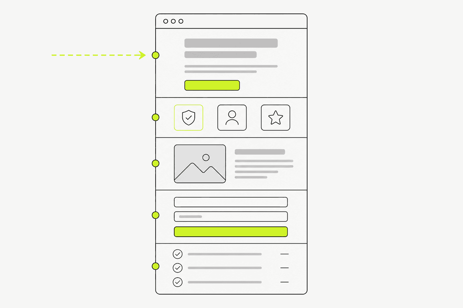
A working order usually runs offer → short proof → must-know detail → CTA → a short FAQ or reassurance that lowers friction.
Full-site navigation or long optional blocks on a landing page often pull people away from the campaign’s single goal.
01
Blocks you usually need
It does not need to be an article—but every block should help someone decide to act.
Headline and offer summary that match the ad
Short proof or benefits that feel believable
Details required before deciding
Form or primary CTA
Contact or short answers to common doubts
Clear structure before design keeps message and convert points from getting crowded late in the campaign.
03
What we actually deliver
What you should keep after handover is campaign-ready: a page that matches the offer, a form that reaches the team, and conversion counting from day one.
Typical scope covers structure and copy, page design, a fast mobile build, form or convert wiring, and basic measurement setup.
Structure and copy focused on one conversion
Responsive design and development
Form, alert, or purchase point connected
Basic tracking configured before handover
The destination should stay short, match the ad, and measure conversion from day one.04
Work order—and what breaks when ads go live
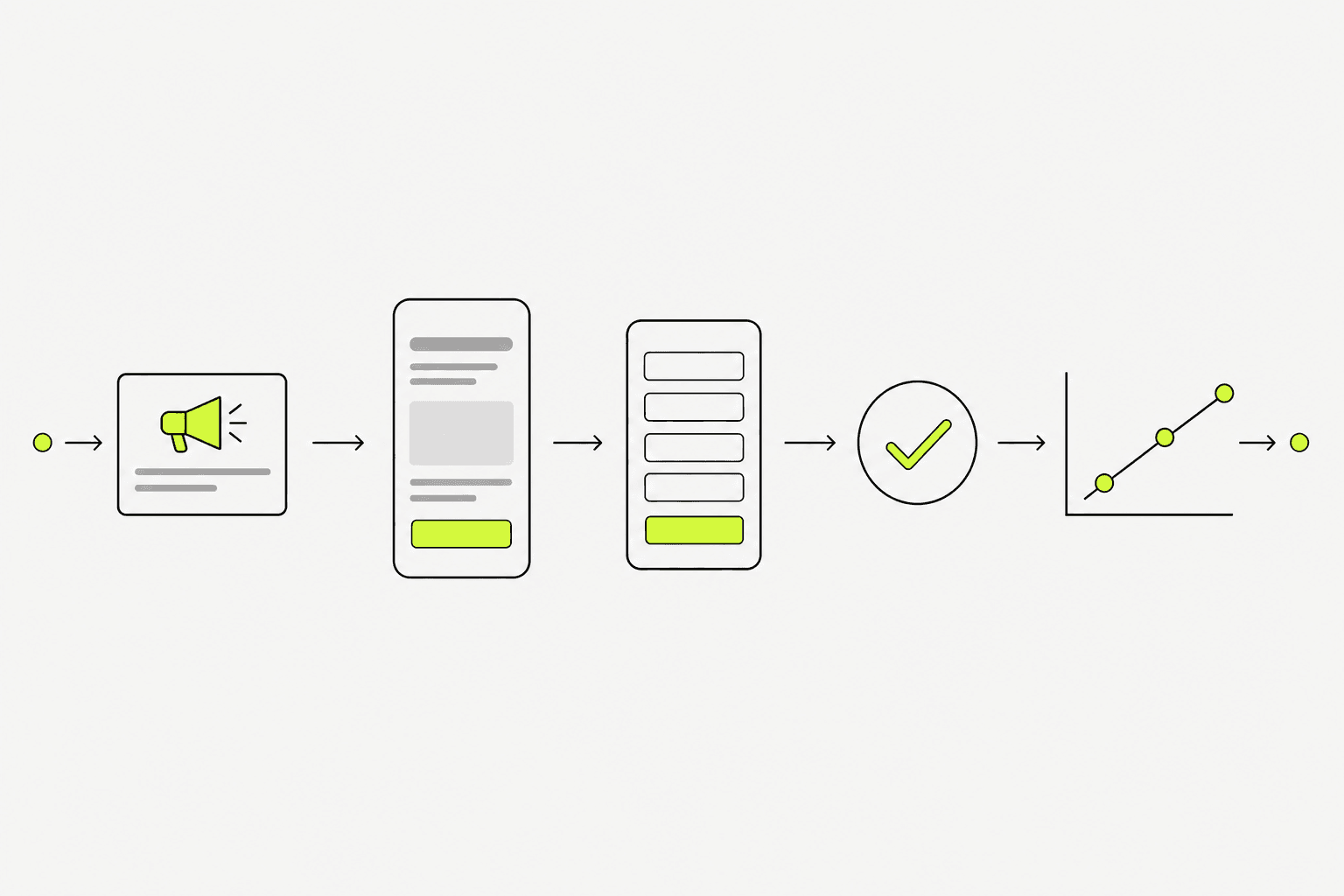
A fast, budget-safe order is conversion goal → message structure → design → build → tracking → ads on. Changing the core offer after design is done often means rebuilding most of the page.
At launch, failures rarely sit in the background colour. They sit in forms that never arrive, slow mobile pages, missing UTM/conversion setup, and page copy that does not match the creative.
01
How we work
Each stage is short and checked so the campaign can launch on plan.
Lock one conversion and the audience coming from ads
Structure message and CTA before visual design
Build, connect the form, and set measurement
Mobile-test, then hand over for campaign launch
02
Checks before ads go live
This short list reduces wasted spend from a destination that is not ready.
Headline matches the ads you are about to run
Form or CTA works on mobile
Team alerts fire when a lead arrives
Conversion / thank-you tracking is counting
Preparation
Information to prepare before you start
05
01The single offer you want after an ad click
02Headline and proof points that match ad creative
03How leads or purchases reach a person who can respond
04Contact details or objections that must be answered briefly on-page
05Ad tools and measurement points you need connected